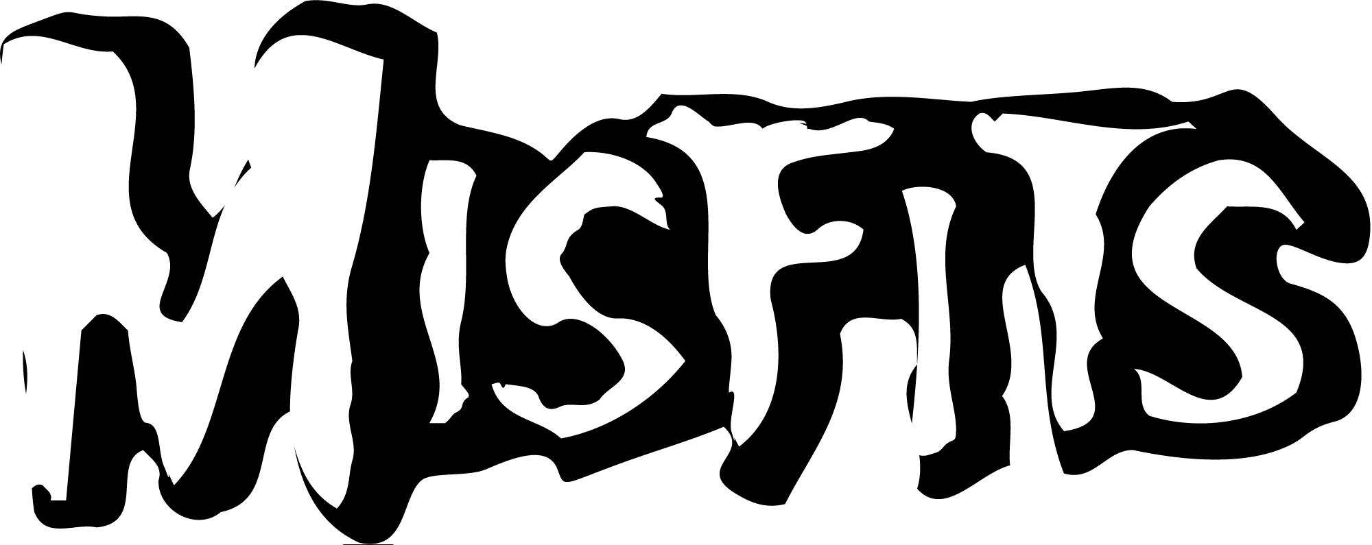
The Misfits logo, featuring a skull known as the “Fiend Skull,” symbolizes rebellion and punk rock culture. Its design is simple yet iconic, reflecting the band’s enduring influence.
![]()
The Misfits are an American punk rock band formed in 1977, have left an indelible mark on the music and fashion worlds with their distinctive logo. This emblem is more than just a visual identity; it’s a symbol of the band’s legacy, representing their themes of horror and the macabre.
The logo’s design is straightforward, featuring a stylized skull that encapsulates the essence of punk’s defiance against mainstream norms. Over the years, the Misfits logo has become synonymous with punk rock itself, embodying a spirit of nonconformity and independence. Its history is as rich and compelling as the music of the band it represents, making it a timeless icon in both the music industry and popular culture.
Design Elements
The Misfits logo, an emblem of rebellion and edgy musical prowess, tells a story that goes beyond the surface. It’s a visual representation of the band’s legacy, encapsulating the spirit of their music and the ethos of the brand. With an intriguing history and deep-seated meaning, the logo has become an icon in the punk rock world. Let’s dissect the design elements that make the Misfits logo so distinctive and memorable. These elements combine to create a brand image that’s instantly recognizable and deeply connected to the band’s identity.
Color Palette
The Misfits logo’s color palette is as bold and dramatic as the band’s music. Traditionally, it features a stark contrast of black and white, mirroring the horror punk aesthetic the band is known for. The black background signifies power, mystery, and the unknown, much like the eerie themes in their lyrics. White, on the other hand, is used for the iconic ‘Crimson Ghost’ skull, offering a stark contrast that grabs attention. This simplicity allows for versatility, making the logo suitable for various merchandise and promotional materials. Occasionally, splashes of red appear to represent intensity and passion, a nod to the band’s energetic performances. The table below outlines the significance of each color within the Misfits logo:
- Black: Mystery, Power, Elegance
- White: Purity, Simplicity, Contrast
- Red: Passion, Energy, Danger
These colors work together to create a visual impact that resonates with fans and maintains brand consistency across all platforms.
Typography
Typography plays a crucial role in the Misfits logo, adding character and style to the brand’s visual identity. The band’s name is often depicted in a jagged, horror-inspired typeface that reflects the punk attitude and the dark themes of their music. This font style is bold and uncompromising, capturing the band’s raw energy. The unique letterforms, with their sharp edges and points, evoke a sense of chaos and rebellion. The choice of typography not only complements the iconography but also ensures the logo’s legibility across various applications. The table below presents the characteristics of the Misfits’ typography:
- Boldness: Conveys strength and presence
- Jagged Edges: Reflects a rebellious spirit
- Legibility: Maintains clarity at different sizes
The consistent use of this distinctive typography has helped cement the Misfits’ brand in the minds of punk rock enthusiasts worldwide.
Iconography
Iconography is at the heart of the Misfits logo, with the ‘Crimson Ghost’ skull being one of the most iconic elements. This skull, taken from the 1946 serial of the same name, has become synonymous with the band. It symbolizes the blend of punk and horror that defines the Misfits’ genre. The skull is simple yet powerful, a fitting mascot for the band’s dark lyrical themes and aggressive sound. The use of the skull also pays homage to the band’s love for horror films, a recurring influence in their work. The following points highlight the key aspects of the Misfits’ iconography:
- The ‘Crimson Ghost’ Skull: Central visual element, symbolizing horror influences
- Horror Film Imagery: Reflects the band’s thematic inspirations
- Punk Attitude: Represents the band’s musical and cultural stance
The consistent application of this imagery across the Misfits’ merchandise, albums, and promotional material has helped create a strong and enduring brand identity.
Misfits Meaning And History
The Misfits logo stands as a powerful emblem in the punk rock world, encapsulating the band’s essence, history, and brand. Its design, replete with meaning and an intriguing backstory, has left a lasting impact on fans and the music industry alike. Let’s delve into the intriguing journey of the Misfits logo, exploring its origins, evolution, and the cultural significance it holds today.
Origins Of The Logo
The Misfits logo, with its striking and unforgettable design, has a fascinating origin story. The group’s name was inspired by Marilyn Monroe’s final film, a choice made by founding soloist Glenn Danzig. This romantic inception might seem at odds with the band’s punk ethos, but it reveals the depth and complexity behind their identity. The logo itself was created in 1977, reflecting the group’s unique blend of horror, punk, and rock elements. It was not just a symbol but a declaration of the band’s mission to disrupt the music scene with their bold and shocking performances.
- The group’s name comes from Marilyn Monroe’s last movie, linking Hollywood’s glamour with punk rock’s raw edge.
- Glenn Danzig, the band’s founding member, was instrumental in choosing the name and creating the logo, showcasing his vision for the band.
- 1977: The year the iconic logo was born, marking the beginning of a new era in punk rock history.
Evolution Over Time
Since its inception in 1977, the Misfits logo has undergone various transformations, each reflecting the band’s evolving identity and the changing times. Initially, the logo’s raw and edgy design mirrored the punk rock ethos, capturing the spirit of rebellion and non-conformity. Over the years, as the band experimented with different musical styles and themes, the logo too adapted, becoming more polished and complex. Despite these changes, the core elements remained, ensuring the logo continued to be a powerful symbol of the band’s legacy.
- 1977: The original logo is introduced, featuring a skull that would become synonymous with the band.
- 1980s: The logo sees minor tweaks, reflecting the band’s growing popularity and the evolving punk scene.
- Present: Today, the logo combines elements from its various iterations, embodying the band’s rich history and ongoing influence.
Cultural Significance
The Misfits logo transcends its role as a mere symbol for the band, becoming a cultural icon in its own right. It represents a bold statement against mainstream music and society, embodying the punk ethos of rebellion, individuality, and freedom. Fans of the band, and of punk rock in general, have embraced the logo as a badge of honor, a way to connect with like-minded individuals and celebrate their shared values. The logo’s widespread recognition and adoption across various mediums attest to its enduring appeal and significance.
- Symbol of rebellion: The logo stands as a testament to the punk rock spirit of challenging norms and expressing individuality.
- Community: It fosters a sense of belonging among fans, uniting them under a common banner of music and ideals.
- Legacy: The logo encapsulates the band’s enduring impact on music and culture, inspiring new generations of artists and fans.
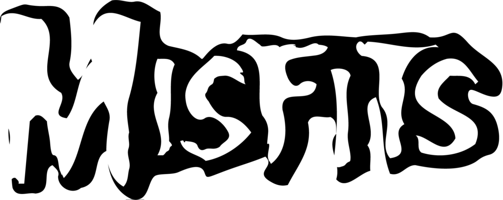
Brand Identity
![]()
The Misfits logo stands as a powerful symbol of the brand’s identity, encapsulating its ethos and cultural footprint. The logo’s design, meaning, and history are woven into the fabric of the brand, creating a visual representation that resonates with fans and followers worldwide. It bridges the gap between the brand’s past and its ongoing narrative, forging a connection with its audience through an iconic image. As we explore this emblem, let’s delve into the specifics of its brand identity, considering who it speaks to and the core values it represents.
Target Audience
The Misfits logo appeals to a diverse group, yet it’s tailored to resonate with specific demographics. Its bold and rebellious flair attracts individuals who appreciate uniqueness and stand against the norm. Here’s a snapshot of the logo’s target audience:
- Youthful energy: Teens and young adults who challenge traditional values and seek self-expression.
- Alternative communities: Those immersed in subcultures such as punk, goth, or indie scenes.
- Creative minds: Artists and creators looking for inspiration in unconventional places.
The logo’s appeal stretches across various mediums, from music to fashion, signaling a broader cultural impact. To illustrate this, consider the following table showcasing the diverse touchpoints where the Misfits logo leaves its mark:
| Medium | Impact |
|---|---|
| Music | Embraced by bands and fans alike for its punk rock roots. |
| Fashion | Adopted by designers for its edgy and timeless appeal. |
| Pop Culture | Featured in films and TV, representing anti-hero narratives. |
Brand Values
The Misfits brand is a beacon of particular values that are reflected through its distinctive logo. These values resonate with the audience, creating a strong bond and a loyal following. Here are the key values the brand upholds:
- Individuality: Celebrating the unique and the unconventional.
- Rebellion: Questioning authority and societal norms.
- Creativity: Fostering innovation and artistic expression.
- Community: Building a sense of belonging among like-minded individuals.
These values are not just abstract ideas; they are deeply ingrained in every aspect of the brand, from product offerings to community events. To visualize how these values come to life, consider their expression in practical terms:
| Value | Expression |
|---|---|
| Individuality | Limited edition releases and custom merchandise options. |
| Rebellion | Sponsorships of alternative events and outspoken social media presence. |
| Creativity | Collaborations with avant-garde artists and designers. |
| Community | Forums and meetups for fans to connect and share experiences. |
Influence On Pop Culture
The Misfits logo, with its striking design and deep-rooted meaning, has left an indelible mark on pop culture. Since its inception, this logo has not only represented the band but also become a symbol of rebellion and individuality. The iconic skull motif resonates with fans across the globe, transcending the boundaries of music to influence fashion, art, and lifestyle. Let’s explore how this emblem has impacted the music scene and merchandising world.
Music Scene
The Misfits logo, often referred to as the “Fiend Skull,” has become synonymous with punk rock’s raw energy and DIY ethos. Its influence on the music scene can be observed in several ways:
- Band Identity: The logo helped cement the Misfits’ brand, making them instantly recognizable.
- Genre Symbol: It became a defining image for punk and horror punk genres.
- Visual Aesthetic: Many bands have emulated the logo’s style to capture a similar spirit.
Moreover, the Misfits’ visual impact extends beyond the stage. Their album covers, posters, and promotional materials all feature the iconic logo, linking visual art tightly with their music. This strong visual branding has inspired a wave of merchandise that fans eagerly collect.
Merchandising Impact
The Misfits logo has not only influenced the music industry but also made a significant splash in the world of merchandising:
- Fashion Statement: The logo has been sported on t-shirts, jackets, and accessories, becoming a staple in alternative fashion.
- Collector’s Items: Limited edition releases of Misfits merchandise often become collector’s items, coveted by fans worldwide.
- Brand Collaborations: The enduring popularity of the logo has led to collaborations with major brands, further solidifying its place in pop culture.
From clothing lines to action figures, the Fiend Skull appears on a wide array of products, allowing fans to showcase their affinity for the band. This merchandising success illustrates the logo’s powerful connection with the audience, making it a timeless icon in the realm of music and beyond.
Logo Variations
The Misfits logo, a striking emblem of punk rock history, is not just a symbol but a story. Its design, meaning, and brand history are rich with culture and evolution. The logo has seen various transformations over the years, often reflecting the band’s own journey. Let’s dive into the exciting world of Misfits logo variations, exploring how alternative designs and limited editions have contributed to the legacy of this iconic mark.
Alternative Designs
The Misfits logo, famously known as the “Crimson Ghost,” has undergone several alternative designs since its inception. These variations cater to different themes, events, and creative explorations. Bold and simple, each design carries the essence of the Misfits while offering a fresh take:
- Color Variations: The classic black and white has seen splashes of color, adapting to merchandise and album covers.
- Graphic Elements: Sometimes, additional graphics like flames or cobwebs are incorporated, enhancing the eerie punk vibe.
- Typography Changes: The Misfits’ typeface has shifted from bold block letters to more jagged and distressed fonts, reflecting the band’s raw energy.
These alternative designs have not only kept the Misfits relevant but also allowed fans to see the logo in new lights, maintaining its status as a cultural icon.
Limited Editions
Limited edition logos are a Misfits’ staple, often released to commemorate special events or anniversaries. These logos are highly sought after, creating a buzz among collectors and fans alike. Here’s how these limited editions stand out:
- Collaborations: The Misfits have partnered with artists and brands to create unique logo versions, blending different artistic styles with the classic Misfits imagery.
- Event-Specific Logos: Concerts and tours often get their own special logo, making each event a memorable experience.
- Anniversary Logos: Milestone years are celebrated with logos that pay homage to the band’s legacy while looking to the future.
These limited editions not only serve as a testament to the band’s evolving brand but also as a canvas for creativity and expression.
Using The Misfits logo PNG
The Misfits logo, recognized by its iconic skull design, carries deep meaning and history within the punk rock scene. This emblem, signifying rebellion and uniqueness, has become a brand symbol that transcends music. With its edgy aesthetic, the logo has found a place in various creative realms. The PNG format of the Misfits logo offers versatility and ease of use for fans and designers alike. It allows for a range of applications, from digital artwork to merchandise design, maintaining its high quality across various mediums. Using the PNG version ensures that the integrity of this powerful image remains intact.
Download Sources
Accessing the Misfits logo in PNG format is straightforward. Below the Misfits logo png image there is a download button click there, and these Misfits logo png will be easily saved to your device for free.
Creative Uses
The Misfits logo in PNG format opens a world of creative possibilities. Its transparency allows it to blend seamlessly with various backgrounds and textures. Designers can incorporate the logo into:
- Custom Apparel
- Event Posters
- Stickers and Decals
- Online Content
For instance, a T-shirt design can feature the Misfits logo over a tie-dye pattern, tapping into the punk and DIY ethos. In digital spaces, the logo adds a touch of edginess to websites, social media profiles, and online communities. It’s important to use the logo respectfully, keeping in mind its cultural significance and the values it represents.
Here are some tips for using the Misfits logo creatively:
- Match the logo with complementary fonts for a cohesive look.
- Use the PNG in animations to bring the logo to life.
- Combine the logo with other punk icons for a collage effect.
Remember, the Misfits logo is not just an image; it’s a statement. Use it to make your projects stand out and pay homage to the punk rock legacy.
Fan Interpretations
The Misfits logo stands out in the world of music and pop culture. Its design, meaning, and history are well-known. Fans of the band have taken this iconic image to new heights. They’ve created their own art and projects. Let’s dive into how fans have interpreted this famous logo.
Artistic Expressions
Fans have transformed the Misfits logo in many creative ways. They use it in art, fashion, and digital media. Here are some examples:
- Tattoos: Many fans show their love by getting the logo tattooed.
- Custom Clothing: Some fans create their own Misfits-themed clothes.
- Digital Art: Artists often share their logo interpretations online.
These expressions show how deeply the logo connects with fans. It’s more than just a symbol. It’s a part of their identity. Here’s a table showing the variety of artistic expressions:
| Type | Examples |
|---|---|
| Tattoos | Skulls, Album Covers |
| Clothing | T-shirts, Jackets |
| Digital Art | Wallpapers, Fan Art |
Community Projects
Fans also come together to create community projects. These projects help spread the love for the Misfits. Here are a few ways fans collaborate:
- Fan Zines: Collections of art and stories about the band.
- Music Covers: Bands and solo artists cover Misfits songs.
- Online Communities: Fans discuss the band and share content.
These projects bring fans closer. They create a sense of belonging. Fans use the logo to unite and share their passion for the Misfits. Below are examples of community projects:
| Project Type | Description |
|---|---|
| Fan Zines | Magazines made by fans, for fans. |
| Music Covers | Artists interpret Misfits songs in their style. |
| Online Communities | Forums and social media groups for Misfits fans. |
Frequently Asked Questions
What Is The Misfits Logo Design?
The Misfits logo features a stylized skull, often referred to as the “Fiend Skull”. It is a bold, iconic image that represents the band’s punk rock identity and has become synonymous with their brand.
How Does The Misfits Logo Convey Its Meaning?
The Misfits logo’s skull conveys themes of rebellion and non-conformity, aligning with the band’s punk ethos. Its stark, striking appearance embodies the Misfits’ dark, edgy musical style.
What’s The History Behind The Misfits Logo?
The Misfits logo was introduced in the late 1970s. Artist and musician Glenn Danzig designed it, drawing inspiration from a 1940s movie serial, “The Crimson Ghost”. It quickly became a punk culture icon.
How Has The Misfits Brand Utilized Their Logo?
The Misfits brand has used their logo extensively on merchandise, albums, and promotional materials. It’s a key part of their visual identity, making their products instantly recognizable to fans.
Conclusion
The Misfits logo stands as a powerful symbol, encapsulating the brand’s rebellious spirit and rich history. Its design evolution and embedded meanings have left an indelible mark on the culture of branding. Whether you’re a fan or a design enthusiast, the iconic skull represents more than just an image; it’s a legacy in punk and contemporary fashion.
For those seeking the logo in PNG or further insights, remember its story is as captivating as its design.