The Temu logo stands out in its industry. Its unique design captures attention and communicates the brand’s essence. Understanding the elements of the Temu logo can offer insights into effective logo creation. Whether you’re a designer or a business owner, exploring this logo provides valuable lessons.
This post delves into the key aspects of the Temu logo, highlighting what makes it distinctive. From color choice to typography, every detail matters. Discover how this logo has become a powerful branding tool. Ready to dive in? Let’s explore the world of the Temu logo and uncover its secrets.
Meaning And History
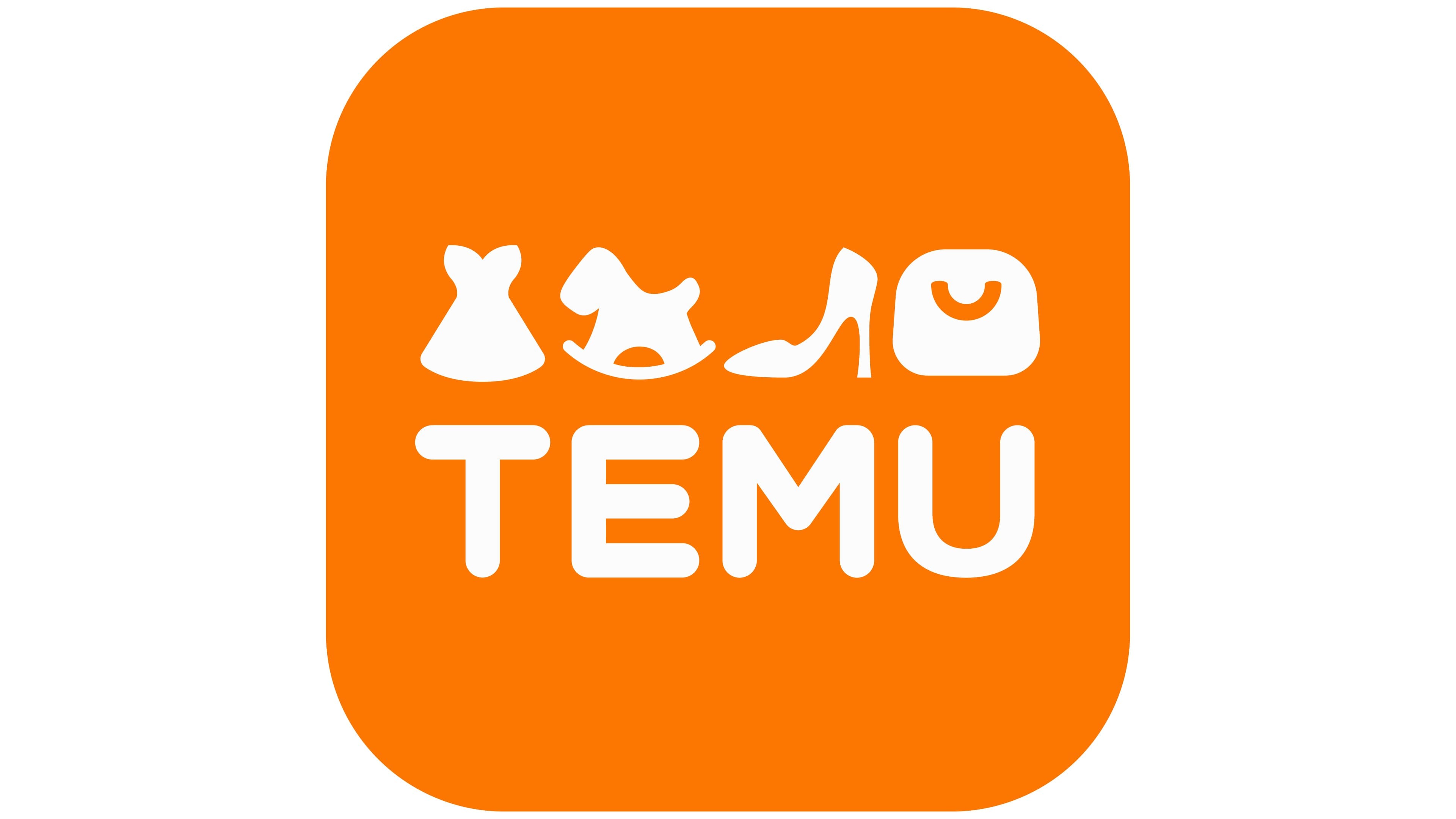
Temu is an online marketplace operated by the Chinese e-commerce company PDD Holdings, which is owned by Colin Huang. It offers heavily discounted consumer goods mostly shipped to consumers directly from China. The image features a vibrant, orange-hued logo for “TEMU.” Its design is playful and minimalist, incorporating abstract silhouettes of a dress, a rocking horse, a high-heeled shoe, and a handbag, followed by a stylized, curvilinear rendition of the TEMU wordmark. These icons represent a variety of product categories, hinting at a diverse shopping experience. The white figures contrast sharply against the lively orange background, creating a striking visual impression that’s modern and energetic.
Meaning Of The Temu Logo
The Temu logo captures the essence of the brand. The vibrant, orange-hued logo for “TEMU” symbolizes energy and enthusiasm. The abstract silhouettes of a dress, a rocking horse, a high-heeled shoe, and a handbag convey the wide range of products available on the platform. This design choice hints at a diverse shopping experience. The playful and minimalist design reflects the brand’s approach to making shopping fun and accessible. The white figures contrasting with the orange background create a modern and energetic visual impression.
History Of The Temu Logo
Since its inception, the Temu logo has remained consistent in its design philosophy. Temu is an online marketplace operated by the Chinese e-commerce company PDD Holdings, which is owned by Colin Huang. From the beginning, the logo featured the same vibrant orange background and white silhouettes. These elements were chosen to represent a fresh and dynamic brand image. Over time, the logo has become synonymous with the platform’s commitment to offering heavily discounted consumer goods. Mostly shipped to consumers directly from China, the logo’s design has played a key role in establishing brand recognition and trust.
Lee Kennedy Font And Colors
The Temu logo is more than just a visual mark; it represents the brand’s identity and values. The choice of the Lee Kennedy font and the vibrant colors used in the logo play a crucial role in conveying the brand’s message. Let’s explore these elements in detail.
Lee Kennedy Font
The Lee Kennedy font used in the Temu logo is modern and elegant. It brings a sense of sophistication and clarity. This font ensures the brand name stands out and remains memorable. The clean lines and balanced spacing make the text easy to read, even at a glance. This is particularly important for a marketplace that aims to attract a diverse audience.
Orange Dominates The Logo
Orange dominates the logo. It’s a joyful and warm shade. This color promises a friendly interface, attentive service, and a wide range of products that satisfy every customer. The color emphasizes fun and fashion, complementing the main message of the advertising, for which the marketplace pays generously to bloggers and influencers. The choice of orange is strategic, as it evokes feelings of happiness and enthusiasm.
Color Harmony
The combination of the Lee Kennedy font and the orange color creates a harmonious and appealing visual. This harmony helps in building trust and recognition among users. The careful selection of these elements ensures that the logo is not only attractive but also effective in communicating the brand’s values.
Brand Identity
The Temu logo represents more than just a visual mark; it encapsulates the essence of the brand’s identity. A logo is vital for brand recognition, and Temu’s logo does just that. It is designed to convey the brand’s values, mission, and vision. Understanding the elements that make up the Temu logo helps in appreciating its significance in the brand’s identity.
Symbolism
The symbolism in the Temu logo is rich and meaningful. Every element in the logo has been thoughtfully chosen to represent the brand’s core values and mission. Here’s a breakdown of the key elements:
- Color Scheme: The colors used in the Temu logo are not random. Each color has a specific meaning. For example, blue might represent trust and reliability, while green could symbolize growth and sustainability.
- Shape and Form: The shapes used in the logo, whether geometric or organic, convey different messages. A circle might represent unity and inclusiveness, while sharp angles could indicate innovation and cutting-edge technology.
- Typography: The font style used in the Temu logo adds to its overall feel. A modern, sans-serif font might convey a sense of forward-thinking and modernity, while a more classic font could suggest tradition and reliability.
Here’s a table summarizing the symbolism of the Temu logo elements:
| Element | Symbolism |
|---|---|
| Color | Trust, Growth, Sustainability |
| Shape | Unity, Innovation |
| Typography | Modernity, Tradition |
Target Audience
Understanding the target audience is crucial for any brand, and the Temu logo is designed with this in mind. The logo aims to resonate with a specific group of people who align with Temu’s values and offerings. Here are the key characteristics of Temu’s target audience:
- Age Group: The primary target audience for Temu is young professionals aged 25-40. This demographic values innovation and sustainability.
- Interests: The audience is likely interested in technology, environmental issues, and social responsibility. They prefer brands that offer innovative solutions and contribute positively to society.
- Geographic Location: Temu targets urban dwellers who have access to technology and are engaged in a fast-paced lifestyle.
- Values: The target audience values transparency, authenticity, and ethical practices. They are drawn to brands that share these values.
To sum it up, the Temu logo is designed to attract and engage a specific group of people who are aligned with the brand’s mission and values. By understanding the target audience, Temu can create a more focused and effective brand identity that resonates deeply with its customers.

Lee Kennedy Color Codes
The Temu Logo stands out with its distinctive design. One key aspect is the Lee Kennedy color codes. These colors are not just visually appealing but also carry a deeper meaning. The font of the inscription is smooth and simple. Rounded glyphs leave a pleasant visual impression. They speak of harmony and comfort.
Primary Colors
Lee Kennedy chose primary colors that evoke specific emotions. They ensure the logo remains memorable and effective. Below is a breakdown of the primary colors used in the Temu Logo:
| Color | Hex Code | RGB Code |
|---|---|---|
| Yellow | #ffcc00 | rgb(255, 204, 0) |
| Orange | #ff6600 | rgb(255, 102, 0) |

Credit: en.logodownload.org
Frequently Asked Questions
What Is The Temu Logo?
The Temu logo is the visual representation of the Temu brand. It typically features distinct design elements and colors that reflect the company’s identity and values.
How Was The Temu Logo Designed?
The Temu logo was designed by a team of skilled graphic designers. They focused on creating a symbol that resonates with the brand’s mission and audience.
Why Is The Temu Logo Important?
The Temu logo is important because it establishes brand recognition. It helps customers easily identify and connect with the brand.
What Colors Are In The Temu Logo?
The Temu logo uses a combination of specific colors. These colors are chosen to reflect the brand’s personality and values effectively.
Conclusion
The Temu logo captures the essence of the brand perfectly. Its design is both modern and memorable. Simple yet striking, it appeals to a broad audience. The logo’s colors are vibrant, drawing attention instantly. Its unique shape sets it apart from competitors.
A well-designed logo speaks volumes about a brand. Temu’s logo does just that. It communicates trust and professionalism. This makes it an effective branding tool. Overall, the Temu logo is a strong visual identity. It will undoubtedly leave a lasting impression on its audience.


