Founded | 1978 |
Founder | Lee Kennedy |
Official Site | www.myleekennedy.net |
Overview | Lee Kennedy is a full-service construction firm that provides feasibility analysis, preconstruction, construction management, and general contracting services. The company was founded in 1978 by Lee Kennedy and is still a family-owned business today. Lee Kennedy Company is headquartered in Boston, Massachusetts, and has offices in Quincy and Woburn, Massachusetts. |
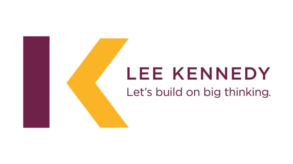
The Lee Kennedy logo is a visually striking design that incorporates both textual and graphical elements. The graphical elements, a vertically oriented burgundy rectangle symbolizing strength and a sharp yellow triangular arrowhead representing dynamism, together form a stylized letter “K.” The left part of the rectangle can also be interpreted as a lowercase “L,” creating a subtle monogram. The textual elements, the company name “Lee Kennedy” in a clean, modern sans-serif typeface and the motto “Let’s Build on Big Thinking,” emphasize professionalism, reliability, and a forward-thinking approach to construction. The overall design effectively conveys the company’s core values.
Meaning And History
Since its foundation in 1977 by Lee Kennedy Sr., the Lee Kennedy company has evolved into a benchmark for quality and reliability in the American construction industry. Built on a foundation of family values and a relentless commitment to client satisfaction, the company remains, at heart, a family business. Today, Lee Kennedy Jr. upholds this vision, driving the business forward while honoring the principles established by his father.
![]()
Lee Kennedy has garnered an elite clientele that includes names like Harvard University, NBC News, Berklee College of Music, Microsoft, and Holiday Inn, among many others. These longstanding relationships reflect the company’s focus on integrity, collaboration, and unmatched service.
In terms of visual identity, the Lee Kennedy logo stands as a testament to this enduring family commitment. Unchanged since it was designed by Lee Kennedy Sr., the logo’s timeless, clean design and thoughtful color scheme reflect both tradition and innovation. This unaltered symbol represents the strength and stability of the Lee Kennedy brand, a respected name that continues to rise in a competitive field.
Lee Kennedy Font and Colors

The Lee Kennedy logo utilizes a geometric sans-serif font, characterized by its clean lines and modern aesthetic. This font choice aligns with the company’s professional image and reflects the precision and structure inherent in the construction industry. The lettering is presented in a bold, dark burgundy color, often referred to as “marsala.” This rich, earthy tone complements the company’s strong and reliable brand identity.
To add a dynamic element, a sharp, triangular arrowhead is incorporated into the logo. This arrowhead is colored in a vibrant yellow, creating a striking contrast with the burgundy lettering. The yellow hue symbolizes energy, optimism, and forward momentum, reflecting the company’s commitment to innovation and progress.
Lee Kennedy color codes
Color | Color Codes |
#811745 | |
#ffb800 |
Conclusion
The Lee Kennedy logo represents a rich history and evolving identity. Its thoughtful design elements, including color and font, convey professionalism and trust. This logo not only reflects the company’s values but also connects with its audience effectively. Understanding its significance can enhance appreciation for this iconic brand symbol.

