The CapCut logo represents the visual identity of the popular video editing app CapCut. It is recognizable for its minimalist design and modern appeal.
CapCut is a free all-in-one video editing app that allows users to create stunning videos with a range of editing tools at their fingertips. Developed by ByteDance, the same company behind TikTok, CapCut has rapidly gained popularity among content creators for its user-friendly interface and advanced features.
With its straightforward logo, CapCut conveys its commitment to simplicity and efficiency in video editing. The logo’s design reflects the app’s sleek functionality, making it a staple on the screens of amateur and professional video editors alike. As video content continues to dominate social media, the CapCut logo has become synonymous with quick accessible, and creative video production.

Capcut Origin
The CapCut Logo represents a powerful tool in the world of video editing. Understanding its origin helps us appreciate its evolution and popularity. CapCut, formerly known as ViaMaker, is a Chinese short-form video editing app developed by ByteDance. The app was first released in China in 2019 and was initially available for iPhone and Android users. In 2020, it was renamed to CapCut and launched internationally. It later expanded to include web and desktop versions for both Mac and Windows. By 2022, CapCut reached an impressive milestone of 200 million active users.
Capcut Features
Capcut has many things that make it special. Here are some:
-
Video effects: Make your video look cool.
-
Music library: Add songs to your video.
-
Text and stickers: Say more with your video.
-
Easy sharing: Show your video to friends.
History And Meaning Of The Capcut Logo
The CapCut logo represents more than just a design. It reflects the app’s journey and purpose. The decision to create a convenient and completely free video editor was not accidental. This program serves as an additional service for users of the main platform, TikTok. With it, creators of short videos can quickly shoot and post materials. The emblem for the program appeared together with the application. It has proven to be very successful and remains constant despite two rebrandings.
Evolution Of The Capcut Logo
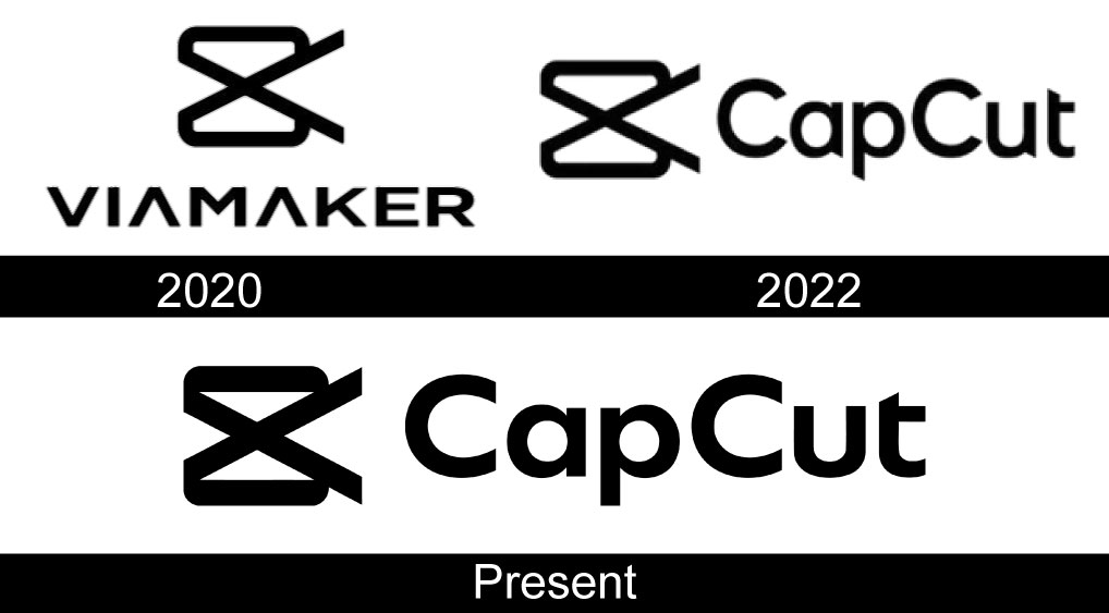
The CapCut logo has undergone several transformations since its inception. Each change reflects the app’s growth and evolving identity. Understanding the evolution of the CapCut logo helps users appreciate its journey. The logo’s design captures the essence of video editing, making it appealing and recognizable.
1. 2020
In 2020, the service was initially called Viamaker. This name indicated the auxiliary role of the program. It aimed to assist users in video creation and editing. The logo featured unique elements that represented its purpose. The primary design elements included:
-
Videotape rings
-
An inverted camera
-
Hourglass shape
The logo icon crossed the rings, symbolizing the integration of video and editing features. The design aimed to convey creativity and functionality. The vibrant colors made it eye-catching for users. The name Viamaker suggested a tool for making videos. This branding strategy helped the app gain initial traction.
2. 2020–2022

By 2022, the name of the program was quickly changed to CapCut. This new name was more abrupt and shorter. It was easier to remember and pronounce. The logo evolved along with the name change. The inscription was placed after the image of the scissors. This design choice emphasized the editing aspect of the app. The compound name of two words with three letters each resembled a sample of a finished edited video after trimming.
|
Feature |
Details |
|---|---|
|
Logo Name |
Changed from Viamaker to CapCut |
|
Design Elements |
Scissors with text |
|
User Focus |
Highlighting video editing |
This change helped clarify the app’s purpose. Users quickly identified CapCut as a video editing tool. The adjustments made the logo more relevant to its target audience.
3. 2022– Present
The CapCut logo has been slightly adjusted. The letters have been made lower but bolder, enhancing readability. Now, the emblem takes up less space on the screen. It stands out more, effectively catching users’ attention.
-
Bold letters improve visibility
-
Compact design fits screens better
-
Emphasis on modern aesthetics
These adjustments reflect current design trends. The logo resonates well with users. CapCut continues to be a popular choice for video editing. Its evolution shows commitment to user experience and brand identity.
Logo Design Elements
![]()
The Capcut logo stands out in the world of video editing. It represents creativity and simplicity. Logo design elements play a crucial role in conveying the brand’s identity. Each element, such as font, color, and shape, contributes to the overall message. Let’s explore these elements in detail.
1. Font
The font used in the Capcut logo is distinctive and memorable. It reflects the brand’s modern approach to video editing. Here are some key characteristics of the font:
-
Unique Design: The font features a shortened crossbar on the letter “t.” This small detail sets it apart from other fonts.
-
Resilient Inscription: The letters have smooth curves, which create a friendly and inviting feel.
-
Simplicity: The font emphasizes the ease of use of the Capcut program.
|
Characteristic |
Description |
|---|---|
|
Style |
Modern and sleek |
|
Crossbar |
Shortened on the “t” |
|
Curves |
Smooth and friendly |
|
Readability |
Easy to read at a glance |
This font choice effectively communicates the brand’s focus on user-friendly editing tools. It invites users to explore the creative possibilities within the program.
2. Color
The color palette of the Capcut logo is simple yet powerful. The logo’s black color resonates with the film’s dark color. This choice reflects the world of video editing. Here are some insights about the color:
-
Black Color: Symbolizes elegance and professionalism.
-
Contrast: The black stands out against lighter backgrounds, enhancing visibility.
-
Emotion: Black evokes a sense of seriousness and creativity.
|
Color |
Meaning |
|---|---|
|
Black |
Elegance and professionalism |
|
Contrast |
Enhanced visibility |
|
Emotion |
Seriousness and creativity |
The color choice speaks of working with a draft using special tools. It creates a strong brand identity that resonates with users. This helps them feel connected to their creative process.
3. Shape
The shape of the Capcut logo is visually striking. It resembles a camera, which connects directly to video editing. Here are some details about the shape:
-
Camera Icon: The design resembles a camera, symbolizing video creation.
-
Inverted Crossing: The middle of the logo features an inverted crossing, adding uniqueness.
-
Text Placement: The black CapCut text is placed next to the icon, ensuring balance.
|
Element |
Description |
|---|---|
|
Icon |
Camera-like design |
|
Crossing |
Inverted crossing in the middle |
|
Text |
Black CapCut text beside the icon |
This shape emphasizes the program’s purpose. It visually communicates the brand’s focus on video editing. Users can immediately understand what Capcut offers.
Use CapCut Logo PNG Images
The PNG format is highly favored for logos because it supports transparent backgrounds and high-quality imagery. For CapCut logo PNG is ideal for use in digital environments where crisp, clear images are essential, such as websites, app interfaces, and promotional materials.
How to Download and Use the CapCut PNG Logo
The CapCut logo in PNG format can be accessed via official brand resources. When downloading the logo, users can choose from various resolutions, making it suitable for both online and offline use. PNG files allow for easy integration into web designs, presentations, and media kits without loss of quality.

Frequently Asked Questions
What Is The Capcut Logo’s Significance?
The Capcut logo represents creativity and video editing innovation. It features a modern design that reflects the app’s user-friendly interface. The logo’s colors are vibrant, symbolizing energy and inspiration for content creators. Overall, it embodies the essence of video production and editing.
How To Download Capcut Logo For Free?
You can download the Capcut logo from their official website or branding resources page. Ensure you follow their usage guidelines to maintain compliance. Alternatively, check graphic design platforms that offer free logos. Always verify that the source is trustworthy to avoid copyright issues.
Is The Capcut Logo Customizable?
The Capcut logo is typically not customizable for branding purposes. Users can create personalized content within the app, but altering the logo itself is against their policy. Maintaining brand integrity is essential for Capcut, so it’s important to use the logo as provided.
Where To Find Capcut Logo Files?
Capcut logo files are available on their official website and in the app’s help section. For specific formats, explore graphic design websites or branding resource platforms. Always ensure you have permission to use the logo for your projects.
Conclusion
The CapCut logo represents creativity and innovation in video editing. Its sleek design reflects the app’s user-friendly interface. Users can easily create stunning videos with powerful features at their fingertips. Embrace the CapCut experience and elevate your content creation. Explore the endless possibilities that the CapCut logo symbolizes for aspiring videographers.

