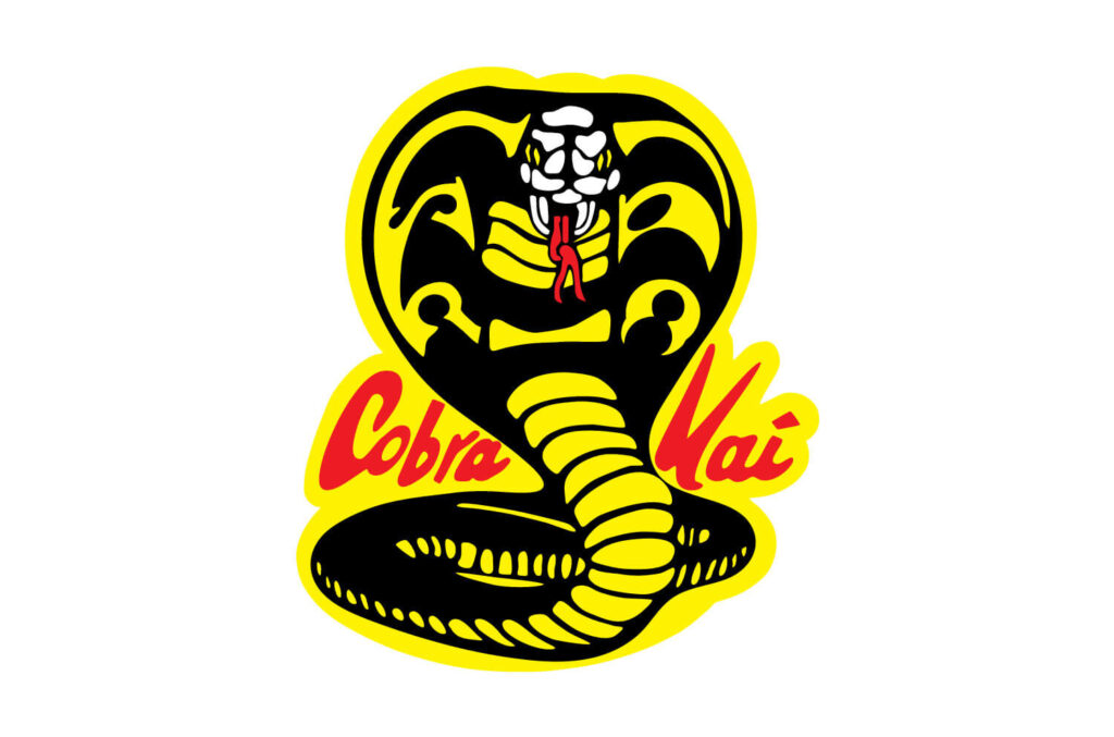
The Cobra Kai logo features a coiled cobra ready to strike, with a bold, aggressive design. It symbolizes strength and resilience.

The Cobra Kai logo, known for its fierce cobra image, stands as an emblem of the dojo’s philosophy. The striking design, with its vibrant colors and detailed cobra, reflects the aggressive and relentless spirit taught in Cobra Kai. This iconic logo captures the essence of martial arts, embodying power and determination.
Recognizable and impactful, it serves as a visual representation of the show’s themes. Fans of the series and martial arts enthusiasts appreciate the logo’s dynamic and memorable design. The Cobra Kai logo remains a significant cultural symbol, resonating with audiences worldwide.
About Cobra Kai
The Cobra Kai logo represents a blend of nostalgia and modernity, capturing the essence of the iconic karate series. The logo is more than just a visual element; it embodies the spirit of the show. Its design is instantly recognizable, connecting fans to the original ‘The Karate Kid’ films while also appealing to a new generation of viewers. Below, we dive deeper into the world of Cobra Kai.
Cobra Kai is an American martial arts comedy-drama television series and a sequel to the original ‘The Karate Kid’ films created by Robert Mark Kamen. The series was created by Josh Heald, Jon Hurwitz, and Hayden Schlossberg, and is distributed by Sony Pictures Television. It was released on YouTube Red / YouTube Premium for the first two seasons, before moving to Netflix starting with the third season.
The series stars Ralph Macchio and William Zabka, who reprise their roles as Daniel LaRusso and Johnny Lawrence, respectively, from the 1984 film ‘The Karate Kid’ and its sequels, ‘The Karate Kid Part II’ (1986) and ‘The Karate Kid Part III’ (1989). The series also stars Courtney Henggeler, Xolo Maridueña, Tanner Buchanan, Mary Mouser, Jacob Bertrand, Gianni DeCenzo, Peyton List, Vanessa Rubio, and Dallas Dupree Young. Martin Kove, Yuji Okumoto, Thomas Ian Griffith, and Sean Kanan also reprise their roles from the films.
The series takes place between 2017 and 2019, exploring the renewed rivalry between Daniel LaRusso and Johnny Lawrence. The show blends martial arts action with humor and drama, captivating audiences young and old.
| Character | Actor |
|---|---|
| Daniel LaRusso | Ralph Macchio |
| Johnny Lawrence | William Zabka |
| Amanda LaRusso | Courtney Henggeler |
| Miguel Diaz | Xolo Maridueña |
| Robby Keene | Tanner Buchanan |
- The series combines nostalgia with fresh storytelling, appealing to both old fans and new viewers.
- The characters are well-developed, bringing depth and complexity to the storyline.
- The show features intense martial arts sequences and emotional drama.
Whether you are a fan of the original films or discovering Cobra Kai for the first time, the series offers something for everyone. The logo itself is a powerful symbol of the show’s legacy and its continued impact on popular culture.
Cobra Kai Logo Meaning and History

The Cobra Kai logo is an iconic symbol from the hit series “Cobra Kai,” a continuation of the beloved “Karate Kid” movies. The logo holds significant meaning and history, reflecting the show’s themes and characters. While discussing the Cobra Kai logo, we need to distinguish between the wordmark shown at the beginning of the series and the more detailed roundel emblem. The logo’s design has evolved to represent the series’ dynamic and intense spirit.
Cobra Kai Wordmark Design
Let’s start with the wordmark. During the first four seasons, the wordmark, which was designed by Geronimo Giovanni, looked pretty much the same. There was only a comparatively small modification for the second season, which was later reversed. The design team that created the logo faced one major challenge. On the one hand, the logo wasn’t supposed to have a pictorial part. On the other, it was supposed to create a certain mood and be meaningful. So, the designers had to rely on their imagination to achieve this goal through the typeface only.
The result is a dynamic and stylish wordmark. While it doesn’t say “karate” or even “fighting,” it does send a certain subliminal message that prepares you for what is going to happen in the series. First, the overall style of the lettering resembles street art – this is how random writing on the wall may look, something written in a hurry, probably in a place, where it is forbidden to write. You can feel the speed of this action in the longer, tilted strokes. More than that, though, this style is about boldness and the desire to leave a mark, which is stronger than the understanding you can be penalized for that.
Evolution Of The Cobra Kai Logo
The Cobra Kai logo has undergone several transformations since its inception. Initially, the wordmark served as the primary identifier, but a more detailed roundel emblem was introduced to add depth and character to the logo. This emblem features a coiled cobra, symbolizing the intensity and ferocity of the Cobra Kai dojo. The combination of the wordmark and the roundel creates a powerful visual representation of the show’s themes.
Symbolism In The Cobra Kai Logo
The cobra in the logo is not just a random choice. It represents the aggressive and relentless nature of the dojo’s philosophy. The coiled position of the snake indicates readiness to strike, embodying the “strike first, strike hard, no mercy” mantra of Cobra Kai. The bold colors and sharp lines of the logo further emphasize the dojo’s fierce and uncompromising approach to karate.
Impact Of The Cobra Kai Logo
The Cobra Kai logo has become a cultural icon, recognized by fans worldwide. Its design effectively captures the essence of the series, combining elements of street art and traditional martial arts symbolism. The logo’s evolution and careful design choices have contributed to its lasting impact and popularity. Whether on merchandise, promotional materials, or within the show itself, the Cobra Kai logo remains a powerful symbol of the series’ enduring legacy.
Origin Of The Logo
The Cobra Kai logo is an iconic symbol in pop culture, representing the fierce and relentless spirit of the martial arts dojo from the famous TV series. The origin of the logo has a rich history rooted in the show’s storyline and its connection to martial arts culture. Understanding the design’s backstory provides a deeper appreciation for its significance.
Inspiration Behind The Design
The inspiration behind the Cobra Kai logo comes from several sources, blending traditional martial arts imagery with unique elements to create a memorable emblem. The logo features a coiled cobra, poised to strike, embodying the dojo’s aggressive philosophy. Here are some key aspects of its design:
- Martial Arts Influence: The cobra is a powerful symbol in martial arts, representing speed, agility, and danger.
- Colors: The logo uses bold colors like yellow and black, which are eye-catching and symbolize caution and danger.
- Typography: The font used for “Cobra Kai” is bold and aggressive, matching the dojo’s ethos of “Strike First, Strike Hard, No Mercy.”
The logo’s design is not just about aesthetics; it reflects the dojo’s philosophy and the show’s themes. The cobra, with its menacing posture, conveys the idea of being ready to strike at any moment. The choice of colors and the aggressive font style further enhance this message.
| Element | Symbolism |
|---|---|
| Cobra | Speed, agility, danger |
| Yellow and Black | Caution, danger |
| Aggressive Font | Strength, power |
In summary, the Cobra Kai logo is a powerful representation of the dojo’s aggressive approach to martial arts. Its design elements are carefully chosen to reflect the values and philosophy of Cobra Kai, making it an unforgettable symbol in the world of television.
Logo Design Elements
The Cobra Kai Logo has become an iconic symbol, recognizable by fans of the hit series. Understanding the elements that make up this logo can provide insight into its powerful impact. Each component of the logo contributes to its overall aesthetic and message. Let’s delve into the key Logo Design Elements that make the Cobra Kai logo stand out.
Color Palette
The color palette of the Cobra Kai logo plays a crucial role in its striking appearance. The combination of black and yellow used in the roundel logo is eye-catching and creates an atmosphere of tension. These are the colors of the wasps, so subconsciously we assume they signal danger. Red only reinforces this impression.
The black in the logo symbolizes power and authority. It provides a strong contrast to the yellow, making the design more prominent. Yellow, on the other hand, is a color associated with energy and caution. Together, these colors create a sense of alertness and aggression, perfectly fitting the spirit of Cobra Kai.
In addition to black and yellow, the logo also uses red accents. Red is a color often linked with danger and excitement. This adds to the overall intensity of the logo, making it even more memorable. The strategic use of these colors ensures that the Cobra Kai logo captures attention and conveys a sense of urgency.
Symbolism Of The Cobra
The symbolism of the cobra in the logo is significant. The cobra is a creature known for its agility and lethal nature, reflecting the martial arts prowess of the Cobra Kai dojo. This symbolism aligns with the aggressive and no-mercy philosophy of the dojo.
In the logo, the cobra is depicted in a coiled position, ready to strike. This stance represents readiness and vigilance, qualities that are essential in martial arts. The detailed design of the cobra, with its menacing eyes and fangs, adds to the fierce and intimidating image of Cobra Kai.
Another key element is the font used in the logo. The font in the roundel Cobra Kai logo is a generic serif type. This choice of font adds a classic and authoritative feel to the logo. It complements the overall design, making the logo look both traditional and formidable.
Overall, the cobra in the logo is not just a decorative element. It carries deep meaning and conveys the essence of Cobra Kai’s philosophy. By using such a powerful symbol, the logo effectively communicates strength, dominance, and an unwavering spirit.
Evolution Over Time
The Cobra Kai logo has become iconic, representing both the classic Karate Kid series and the modern Cobra Kai show. Over the years, the logo has evolved, reflecting changes in design trends and the series’ storyline. This evolution showcases the logo’s adaptability and timeless appeal.
Changes In Design
The design of the Cobra Kai logo has seen several changes since its inception. Initially, the logo featured a simple yet menacing cobra, coiled and ready to strike. The classic design embodied the aggressive nature of the Cobra Kai dojo.
Key Changes in Design:
- Color Scheme: The original logo used bold black and yellow colors, emphasizing the dojo’s fierce spirit. The modern logo incorporates more vibrant colors, adding depth and energy.
- Font Style: The typography has evolved from a basic, bold font to a more stylized and edgy font. This change adds a contemporary feel to the logo.
- Detailing: The cobra illustration has become more detailed and refined over time. The modern design includes intricate scales and a more realistic appearance.
Below is a comparison table highlighting the changes:
| Aspect | Original Logo | Modern Logo |
|---|---|---|
| Color Scheme | Black and Yellow | Vibrant Colors |
| Font Style | Basic Bold Font | Stylized Edgy Font |
| Detailing | Simple Cobra | Detailed Cobra |
Comparison With Original Karate Kid
The original Karate Kid logo and the Cobra Kai logo both hold significant cultural value. The Karate Kid logo features the iconic crane kick pose, symbolizing balance, discipline, and perseverance. In contrast, the Cobra Kai logo, with its coiled cobra, represents aggression, power, and dominance.
Key Differences:
- Symbolism: The Karate Kid logo focuses on a peaceful, disciplined approach to martial arts. The Cobra Kai logo emphasizes a more aggressive, no-mercy philosophy.
- Design Elements: The Karate Kid logo uses a simple, clean design with minimal colors. The Cobra Kai logo is more complex, with vibrant colors and detailed imagery.
- Emotional Impact: The Karate Kid logo evokes feelings of hope and perseverance. The Cobra Kai logo instills a sense of intimidation and strength.
Both logos have their unique charm and have evolved to reflect the themes of their respective series. The evolution of the Cobra Kai logo highlights its ability to adapt and stay relevant while maintaining its core identity.
Social Media Presence
The Cobra Kai logo has become an iconic symbol of the hit TV series. Its social media presence has significantly boosted the show’s popularity. The logo is easily recognizable and draws in fans from all over the world. Let’s dive into how the Cobra Kai logo is utilized on digital platforms and its engagement with fans.
Logo On Digital Platforms
The Cobra Kai logo is prominently displayed across various digital platforms. This helps to create a strong brand identity and attract new viewers. Below are some examples:
- Official Website: The logo is featured on the homepage, merchandise section, and other key areas.
- Streaming Services: Platforms like Netflix use the logo as a thumbnail, making it easy for users to identify the show.
- Social Media Profiles: The logo is used as profile pictures and cover photos on Twitter, Instagram, and Facebook.
Let’s look at how the logo appears on these platforms:
| Platform | Logo Usage |
|---|---|
| Official Website | Homepage, Merchandise |
| Netflix | Thumbnail, Banner |
| Profile Picture, Cover Photo | |
| Profile Picture, Stories | |
| Profile Picture, Cover Photo |
Engagement With Fans
Engaging with fans is crucial for the success of any TV series. The Cobra Kai logo plays a vital role in this engagement. Here are some ways it connects with fans:
- Fan Art: Many fans create and share their own versions of the logo, which are often featured on official pages.
- Contests and Giveaways: The logo is used in promotional materials for contests and giveaways, encouraging fan participation.
- Hashtags: Hashtags like #CobraKai and #CobraKaiLogo are used to group related posts, making it easier for fans to find and engage with content.
The interaction between the show’s creators and fans is enhanced through these activities:
| Activity | Impact |
|---|---|
| Fan Art Sharing | Builds Community |
| Contests and Giveaways | Increases Engagement |
| Hashtags | Enhances Discoverability |
By leveraging the Cobra Kai logo across these methods, the show fosters a strong and active fan base.
Future Of The Logo
The Cobra Kai logo, with its fierce snake and bold colors, has become a symbol of the show’s enduring popularity. As the series continues to captivate audiences, fans are curious about the future of the logo. What changes might be on the horizon? How will the logo continue to resonate with new generations? Let’s explore the potential redesigns and the legacy of the Cobra Kai logo in the coming years.
Potential Redesigns
As the Cobra Kai series evolves, there is always the possibility of a logo redesign. A new logo could bring fresh energy to the brand while maintaining its core identity. Here are some potential redesign ideas:
- Modern Minimalism: Simplifying the logo with clean lines and fewer colors could appeal to a contemporary audience.
- Retro Revival: Embracing vintage styles from the original Karate Kid era might evoke nostalgia and honor the show’s roots.
- Dynamic Animation: Incorporating animation into the logo for digital platforms could create a more engaging experience.
To visualize these ideas, consider the following table highlighting potential redesign elements:
| Redesign Element | Description |
|---|---|
| Color Scheme | Bolder or more subdued colors depending on the desired impact |
| Typography | Modern fonts or classic typefaces to match the show’s tone |
| Symbolism | Emphasizing different aspects of the cobra or introducing new symbols |
These redesigns would ensure the Cobra Kai logo stays relevant and exciting for both longtime fans and newcomers.
Legacy In New Generations
The Cobra Kai logo holds a special place in pop culture. Its influence extends beyond the show, inspiring merchandise, fan art, and more. As new generations discover Cobra Kai, the logo’s legacy continues to grow.
Here are some ways the logo impacts new generations:
- Merchandise: T-shirts, hoodies, and accessories featuring the logo are popular among fans of all ages.
- Social Media: The logo is widely shared on platforms like Instagram and TikTok, reaching younger audiences.
- Fan Art: Artists create unique interpretations of the logo, showcasing its versatility and appeal.
In schools and communities, the logo serves as a symbol of perseverance and strength. Kids and teens identify with the Cobra Kai spirit, embracing its message of resilience. This connection ensures the logo’s enduring legacy.
As the series continues, the Cobra Kai logo will evolve. It will continue to inspire and engage new generations, solidifying its place in pop culture history.

Credit: www.ebay.com
Frequently Asked Questions
What Does The Cobra Kai Logo Symbolize?
The Cobra Kai logo symbolizes strength, resilience, and the “no mercy” philosophy of the dojo. The cobra represents a fierce, aggressive attitude.
Who Designed The Cobra Kai Logo?
The original Cobra Kai logo was designed by the creators of the Karate Kid movie. It has been updated for the TV series.
What Colors Are In The Cobra Kai Logo?
The Cobra Kai logo primarily features black, yellow, and red. These colors are bold and signify aggression and intensity.
Where Can I Buy Cobra Kai Logo Merchandise?
You can buy Cobra Kai logo merchandise on official websites and popular retail stores. Online marketplaces also offer various options.
Conclusion
The Cobra Kai logo embodies the show’s fierce spirit and rich history. Its design captivates fans and newcomers alike. Whether you’re a martial arts enthusiast or a pop culture aficionado, this iconic emblem resonates deeply. Embrace the legacy and power the Cobra Kai logo represents.

